By Trey Plante ‘24 and Dale Ross ‘22
Our goal was to analyze the multiple classifiers that the Wesleyan Media Project has run on political advertisements and uncover the patterns that the classifier identified and utilized to make its predictions. The ABSA classifier works by analyzing the text of an ad for mentions of Joe Biden and Donald Trump and using sentiment analysis to predict which party the ad supports, while the Party All classifier works by running a machine learning method that uses hand-coded party training data to predict ad lean. By investigating how the classifiers actually work, we hope to enable the Wesleyan Media Project to improve the classification of advertisements and, perhaps more importantly, understand what the algorithms we utilize do. In other words, we want to turn our classifiers into something we understand and can explain, instead of a “black box.” The classifiers were run on the WMP’s set of ads from the 2020 election cycle. We analyze the trends and distributions in the set of classified ads to see the underlying patterns our classification algorithm is capturing. With these analyses, we hope to find sources of classification bias and error and seek to explain why the classifier does classify an ad to a specific party. As a result of our research, we were able to improve the classifier’s accuracy over the whole election cycle and uncover trends associated with regionally concentrated ads.
data
Our data was comprised of Facebook advertisement data gathered from the general election in 2020. Facebook provides a comprehensive database of advertisements run on their platforms (Facebook, Instagram, etc.). The dataset we were concerned with is all political advertisements run during the end of the 2020 election cycle. In total, our data consisted of 1.18 million advertisements during the 2020 general election cycle, of which we were mostly concerned with advertisements that were active from September 1st, 2020 until Election Day.
Our data had many iterations. Throughout the iterations, we were concerned with a few variables. These included Ad ID and PD ID (unique entity ID), so we could identify specific ads and sponsors, spending and impression data for each ad, advertisement start and end dates, sponsor names, which is a cleaned entity name variable, classifier predicted ad lean, classifier predicted entity lean, and hand-coded entity lean. Most of our data contained the following files: FB data for advertisement start and stop time gathered using Google BigQuery + WMP Entities file + updated Facebook 2020 general election ad level and entity files with classifier information.
Our first iteration was the original Facebook 2020 general election data. The original classifier classified ads only based on the valence of Trump and Biden mentions using Aspect Based Sentiment Analysis (ABSA) and aggregated ad results at the entity level. It had start date limitations–the ad_stop_time indicates the instructions given by the page to FB when to stop running the ad. The ad would also stop running when its budget is exhausted. So, to effectively gauge actively running advertisements, we used a FB Query on the 2020 general election with only ads that ran on that day. It contained ad id (as a string, with ‘x’ at the start), and the start and end dates of the ad’s run. The dates are extracted from a “daily_delta” archive–it stores a copy of an ad on a day when that had some changes in its status (i.e., impressions, spend, or changes in the distributions). Since “daily delta” was only the ads that ran on that day, it can be used to identify the last day that an ad was “active”. We merged party_all and sponsor_name from the wmp_entities human-coded data set. We did much of our analysis on this classifier.
We also received updated data for the ABSA classifier. This data was based on the classifier where the data was deduplicated for identical advertisements before running the classifier and was run on the advertisement text instead of all text. This was more accurate, yielding around a 99% accuracy rate for those checked against party_all, but still didn’t have a lot of matches for classification and hand-coded party data. We did most of the mismatch results on this data.
We also were provided with advertisement and entity lean data derived from a machine learning method that used a hand-coded sample of sponsor party classifications to predict lean. This had a much higher classification rate than previous data, with around 9000 entities classified. However, since the data was created using party_all, the classified data did not include entries with existing party_all data and so we could not check for mismatches. We used this data to derive histograms of the distribution of classifier results on ad datasets.
methods
We used Google BigQuery to derive some of our datasets and used R to do some data management, which was mostly merging different datasets to gather the necessary fields. Once we had our datasets, we used Python to do most of our data analyses and generate our results. The complete dataset involved 1.18 million advertisements. Most of our analysis was concerned with data visualization. We used the region vector to determine if an ad was focused in one state specifically–and if so, where it was focused. We also used spending and impression data for each advertisement to take a look at temporal trends (using ad stop and start dates to measure active advertisements) and compare across different subsets of the data.
We looked at the advertisements through a temporal lens–specifically, we took a deeper look at ‘mismatched’ advertisements. Mismatched advertisements are advertisements from entities where the classifier’s predicted lean of the entity does not match what the hand-coded data says–essentially, the classifier probably failed on that entity by incorrectly predicting a majority of advertisements to lean in the wrong direction. It is unknown what causes each case, so our analysis was centered on trying to understand patterns of possible classification bias in different iterations of the classifiers. All mismatched ads are advertisements where the entity_lean and party_all variables did not match. All of our graphs were generated using python’s matplotlib library.
results
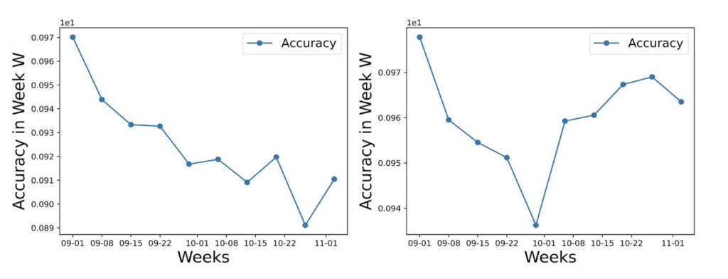
After examining various classification performance metrics over time, we noticed that the original ABSA classifier seemed to perform consistently worse on ads active later in the election (figure 1). Originally, we attributed this classification error to an imbalanced training set, one that contained more ads active during the beginning of the election. However, the training set was curated to represent the distribution of spending across ads, meaning the training set shouldn’t be biased towards one point in time during the election. In fact, by changing the classifier’s features from all of the text associated with the ad, the text in the picture, caption, advertisement body, entity, etc., to only the ad body text, the classification error seemed to dissipate. Thus, the information contained in all of the ad’s associated text seems to create persistently increasing errors as the election goes on, indicating that perhaps this information somehow decreased in quality over time. In the end, the updated classifier still shows a dip in the middle of the election, but only by around a 4% drop from its peak accuracy.
Figure 1: Accuracy of the original ABSA classifier (left), compared to the accuracy of the updated ABSA classifier run on only ad body text (right), where accuracy = (# of ads correctly classified in week n) / (total # of ads in week n)
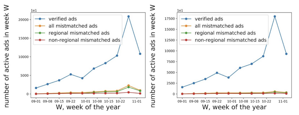
Using our data, which contains hand-coded party and classifier predicted lean results, we were able to show trends of active advertisements. Verified advertisements are advertisements that have hand-coded party and classifier predicted lean data (so we can measure if the classifier was accurate or not), while regional mismatched advertisements are mismatched ads that are targeted/regional. Using the region vector–which contained all the regions that the advertisement was shown in–we were able to gauge whether an advertisement was regionally targeted (the advertisement was focused on one state). This allowed us to gauge where advertisements were active over time for targeted advertisements. As shown in figure 2, over our time period, active ads generally increase as it gets closer to election day. Similarly, mismatched advertisements also spike near election day. While the updated ABSA classification results have fewer verified advertisements (peaking at around 17,500 active advertisements instead of 20,000), it also has disproportionately fewer mismatched advertisements. This confirms that the updated ABSA classifier is indeed more accurate for our time period, and shows no hints of classification bias that is dependent on date.
Figure 2: Simple graphs displaying differences between the overall and mismatched frequency over time between the original ABSA classifier results (top), and the updated ABSA classifier (bottom)
Over time, as the number of active advertisements increases, so does the number of mismatches (figure 2). As shown in figure 3, the same general trends present among the general advertisement population are present in mismatched advertisements from the original ABSA results–as the most advertisements were run in the Midwest, particularly in the weeks leading up to election day, followed by the West and the South, with the Northeast last among the four major regions. While the updated ABSA results show a slightly different trend (with the South displacing the West as the region with the second-highest amount of targeted advertisements run leading up to election day), due to the increased accuracy of the classifier in the updated model combined with the relatively small amount of hand-coded data, this could just be a product of a small dataset.
Figure 3: Differences in regional distribution over time among targeted ads between mismatched advertisements from the original ABSA classifier results (top left), mismatched advertisements from the updated ABSA classifier (top right), and all advertisements (bottom right)
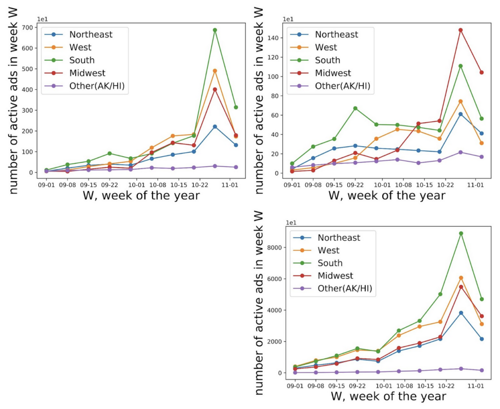
Figure 4 compares spending and impressions in all advertisements to mismatched advertisements. Spending and impressions of active ads in the general body of advertisements have roughly the same trends as each other. Similarly, spending and impressions of active ads in mismatched advertisements have the same trends as each other. However, mismatched advertisements have quite different trends over time than all ads. While in the larger dataset of advertisements, there develops a sizable gap in the later weeks between regional advertisements and non-regional advertisements on both spending and impressions, that gap is much less among mismatched advertisements. These results seem to suggest that non-regional/non-targeted advertisements make up a larger proportion of spending and impressions in the body of mismatched advertisements than they do among the greater body of advertisements. This is a possible source of classification bias, as mismatched advertisements have a higher proportion of spending from non-regional advertisements than all ads do.
Figure 4: Differences in spending (top) and impressions (bottom) over time between all advertisements (left) and mismatched advertisements (right) using original ABSA classifier data
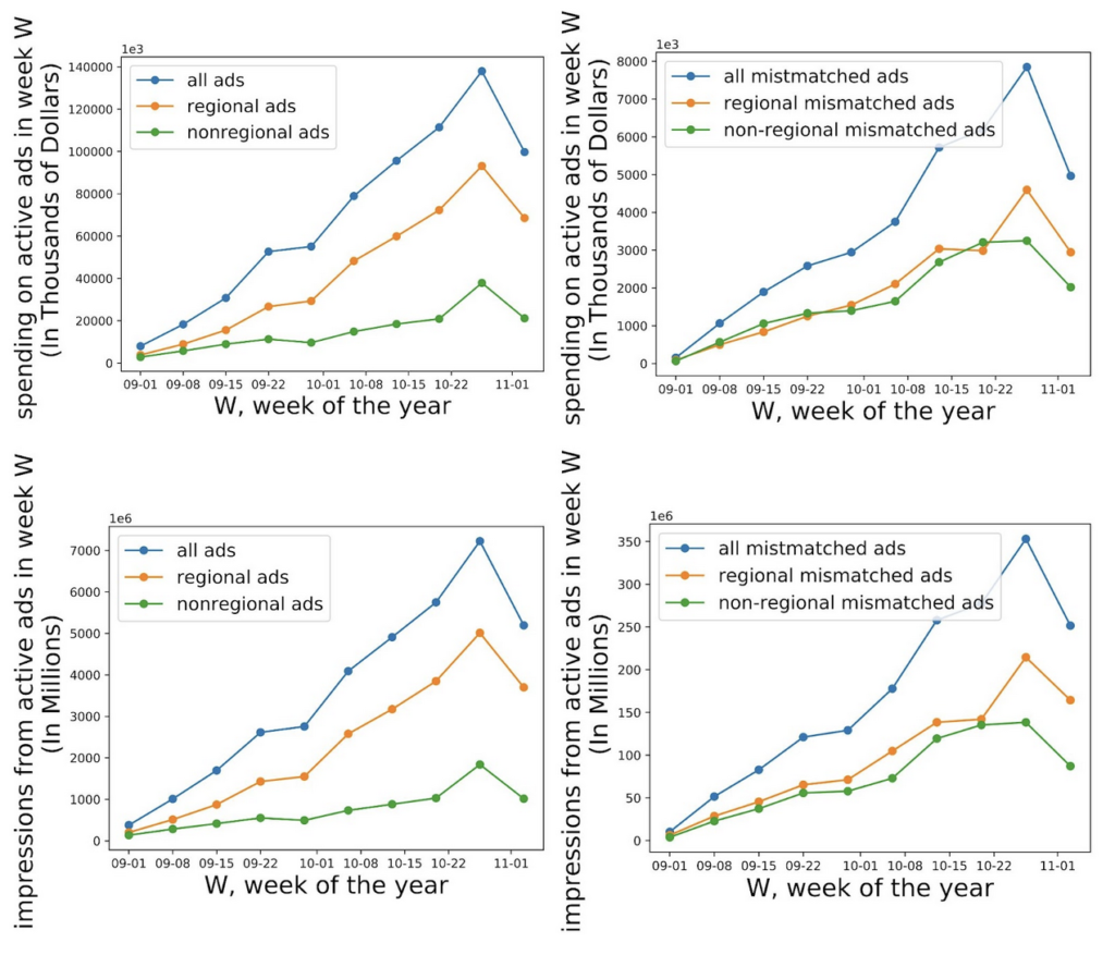
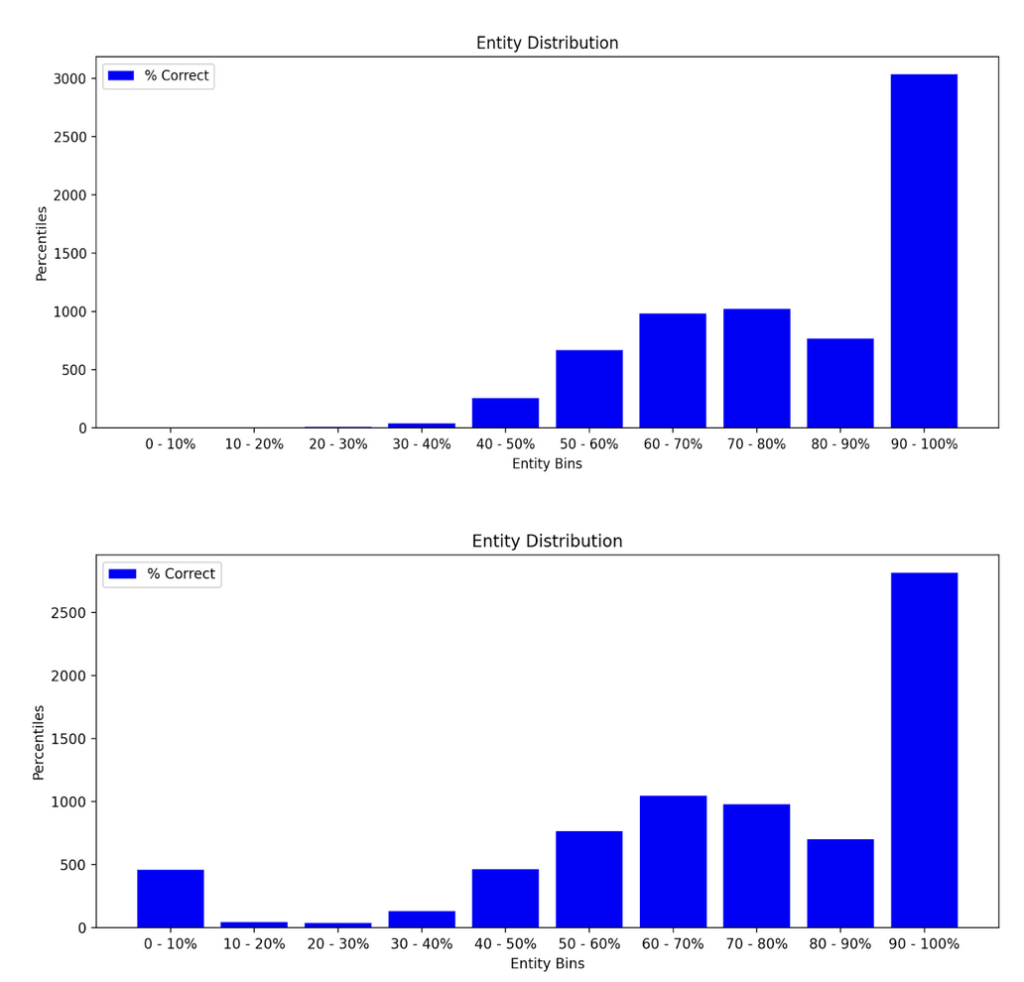
Figure 5 displays the distribution of entities according to the percent of correctly predicted ads from the party_all classifier, placing entities with 90%+ accuracy in the last bin, and so forth. The distribution including all parties seems to have some variance around 0-10%, while the distribution considering only pro-Republican and pro-Democrat ads is very left-skewed. Overall, the distributions seem to confirm the story we already know–the classifier is very accurate, so most of the entities will have high accuracy rates. However, by excluding the “other” category, indicating the sponsor was classified as being affiliated with a third-party, we noticed that the classifier is much better at predicting ads that are either pro-Republican or pro-Democrat. This is probably due to the small sample size of third-party ads compared to the number of ads that are pro-Republican or pro-Democrat. Additionally, we found that although the classifier is very accurate when removing ads affiliated with a third-party, for some entities, the classifier performs worse than 50%, indicating that some entities sponsor ads that are somehow different from the majority of ads.
Figure 5: Histogram displaying the frequency of entities with x% correctly classified ads, considering all possible classification values (bottom) and considering only Republican and Democrat classifications (top)
Conclusion
Through our analysis, we have uncovered some of the classifier’s behavior towards regionally concentrated advertisements, discovered accuracy improvements with feature changes, and noticed broad trends in political ads during the 2020 presidential campaign. With broad sources of error and bias identified, we are now able to dive deeper into data where mismatches are occurring and discover what makes these ads different from the ones the classifier accurately predicts.
We developed some key analyses that both answered and raised some questions. Some of our key findings this semester include the discovery of an increased error rate over time in the original classifier (figure 1) and the presence of a discrepancy of the spending and impression breakdown by regional targeting between mismatched advertisements and the general body of advertisements (figure 4). These findings present two possible sources of classification bias and places of interest to further explore how and where classifiers fail. This data–as well as recent data from the party_all classification method which yields a much higher rate of lean predictions–opens up more questions on classification bias and how different classification methods yield different results.
We have a lot of unanswered questions that we hope to explore next semester. In the future, we hope to explore more granular subsets of classified ads. By analyzing ads within specific regions and sponsored by specific entities, we hope to figure out why some entities and regions have specifically high error rates. Furthermore, we wish to be able to explain the traits of an ad that are classified as either pro-Republican or pro-Democrat by analyzing specific recurrences of similar traits across all ads classified as pro-Republican or all ads classified as pro-Democrat. With a collection of these archetypal traits, we could easily explain how some metadata associated with an ad shifts its classification probability in a direction and we could examine the different strategies utilized by each party in their ads. Soon, we believe, the classifier will become fully explainable.

